 by webriy
The Complete Brand Identity Checklist for Freelance Designers
May 06, 2026A practical, project-ready checklist to make sure you never miss an asset, confuse a client, or lose a file again.
When a client says “can you just send over the brand stuff?” — what do they actually mean?
That’s the problem. They don’t always know. And if you don’t have a system, you’ll spend the next hour digging through Google Drive folders, re-exporting PNGs at the wrong size, and sending four separate emails with assets attached. Not a great look for a professional designer.
Whether you’re onboarding a brand-new client, taking over an existing brand, or wrapping up a full identity project, having a complete brand identity checklist is the thing that separates scattered freelancers from trusted creative partners.
This guide breaks down every single component of a brand identity system — what to create, what to document, and how to deliver it cleanly so clients actually use what you give them.
Why Freelance Designers Need a Brand Identity Checklist
Most freelance designers are good at the creative part. The gaps usually show up in the system around the work.
Without a checklist, you risk:
- Delivering inconsistent file formats across projects
- Forgetting secondary logo variations until the client asks three months later
- Having no documented colour codes, so the client uses “close enough” values in Canva
- Spending unpaid time answering “where’s the file?” emails long after the project closed
A thorough brand identity checklist solves all of this — not by adding complexity, but by making your delivery process repeatable, professional, and complete every single time.
Part 1: Logo System
The logo is the most referenced asset in the entire brand. Clients will use it in more places than you’ve anticipated, so your job is to cover every reasonable scenario upfront.
✅ Primary Logo
The full-form logo — wordmark, lettermark, or combination mark — in its default orientation and colour scheme. This is the version used in most official contexts.
✅ Horizontal / Stacked Variations
Create both a horizontal (landscape) and stacked (portrait) version if the design allows it. Different placements — email signatures, website headers, social media profiles — require different proportions.
✅ Icon / Symbol Mark
An isolated version of the icon or symbol, without the wordmark. This is critical for favicons, app icons, profile pictures, and small-format use.
✅ Monochrome Versions
One all-black and one all-white version of every logo variation. These get used far more than you’d expect — on merchandise, embroidery, white-background documents, and dark overlays.
✅ Reversed / Light-on-Dark Version
A version designed to sit on dark or coloured backgrounds.
✅ Minimum Size Guidelines
Document the smallest size the logo should ever appear at (in both pixels and millimetres) to maintain legibility.
✅ Clear Space Rules
Specify the minimum amount of empty space that must surround the logo on all sides. Include a visual diagram in the guidelines.
✅ File Formats
For each logo variation, deliver:
- SVG — scalable, web-use, editable
- PNG — transparent background, multiple sizes (512px, 1024px, 2048px minimum)
- PDF — print-ready vector
- EPS or AI — editable source file for print vendors
Part 2: Colour Palette
Colours are the easiest thing for clients to get wrong — and the mistakes are immediately visible. Your job is to document every value they’ll ever need.
✅ Primary Palette
Two to four colours that define the core visual identity. These are the colours that appear on the logo, website hero sections, primary buttons, and branded materials.
✅ Secondary / Supporting Palette
Three to six complementary colours for backgrounds, typography, accents, illustrations, and data visualisations.
✅ Colour Codes in Every Format
For every single colour in the palette, document:
- HEX (e.g. #2D4A8A) — web use
- RGB (e.g. 45, 74, 138) — screen/digital
- CMYK (e.g. 67, 46, 0, 46) — print
- Pantone (if budget allows) — spot colour printing
✅ Colour Usage Rules
Which colour is dominant? What’s the ratio of primary to secondary? What combinations are off-limits? Include a do/don’t section with visual examples.
✅ Background and Text Colour Pairs
Document approved text-on-background combinations, particularly for accessibility. Specify which pairs meet WCAG AA contrast standards.
Part 3: Typography System
Typography is where many brand deliveries fall short. Fonts get lost, clients substitute wrong ones, and suddenly the brand looks like a ransom note.
✅ Primary / Display Typeface
The font used for headlines, hero text, and prominent brand statements. Include the font name, foundry, weight(s) in use, and a link to where it can be purchased or downloaded.
✅ Secondary / Body Typeface
The font used for body copy, UI text, and long-form content. Often a more neutral choice that pairs well with the display typeface.
✅ Web-Safe Fallback Stack
For web projects, include a fallback font stack in case the primary fonts fail to load.
✅ Type Scale
Document the standard sizes for:
- H1 through H4 headings
- Body text
- Captions and labels
- Call-to-action text
Include values in both pixels (for screen) and points (for print).
✅ Letter Spacing and Line Height
Specify the tracked spacing and leading values you’ve used. These are the details that make the difference between amateur and refined typesetting.
✅ Font Files or Licence Instructions
Provide the font files if the licence allows distribution, or give clear instructions on where to purchase or download them legally. Flag any web font embed codes.
Part 4: Imagery and Visual Style
✅ Photography Style Guide
Define the visual language for photography: lighting mood, subject matter, colour grading, and what to avoid. Include curated examples.
✅ Illustration Style (if applicable)
If the brand uses custom illustrations, document the style, line weight, colour usage, and any rules around mixing illustration with photography.
✅ Iconography Style
Define the icon style — line icons, filled, rounded, sharp, etc. — along with the size grid and stroke width used.
✅ Pattern and Texture Assets
Any branded graphic elements, background textures, or repeating patterns should be delivered as usable files alongside usage guidelines.
✅ Image Don’ts
Just as important as what to use: document explicitly what to avoid. Over-filtered photography, stock photo clichés, clashing illustration styles.
Part 5: Brand Voice and Messaging
Design and language are inseparable. A brand identity isn’t complete without documentation of the voice that pairs with the visuals.
✅ Brand Mission and Values
One or two sentences on what the brand stands for. These act as a filter for all creative decisions.
✅ Brand Personality Descriptors
Three to five adjectives that define how the brand should feel. (e.g. “Approachable, expert, grounded.”) Include the opposite descriptors too — what the brand is NOT.
✅ Tone of Voice Guidelines
How does the brand write? Is it formal or conversational? Technical or plain-language? Include before/after copy examples that show the difference.
✅ Tagline and Key Messages
The approved tagline and any core messages that should be used consistently across channels.
Part 6: Application Templates
Showing the brand applied to real contexts is what transforms a logo pack into a functional identity.
✅ Business Card
Even if rarely printed today, a designed business card template demonstrates how the visual system applies to a small, constrained format.
✅ Email Signature
An HTML email signature template — or at minimum a mockup with dimensions and colour values — saves clients enormous frustration.
✅ Social Media Profile and Banner Templates
At minimum: profile icon crop and banner for LinkedIn and Instagram. Ideally also Facebook cover, Twitter/X header, and YouTube channel art.
✅ Social Media Post Templates
Two to three Canva or Figma templates for branded social posts, using the approved colour palette and typefaces.
✅ Letterhead and Document Template
A branded letterhead in Word or Google Docs format for proposals, invoices, and correspondence.
✅ Presentation Template
A basic slide deck template (Google Slides or PowerPoint) with branded fonts, colours, and layout guides.
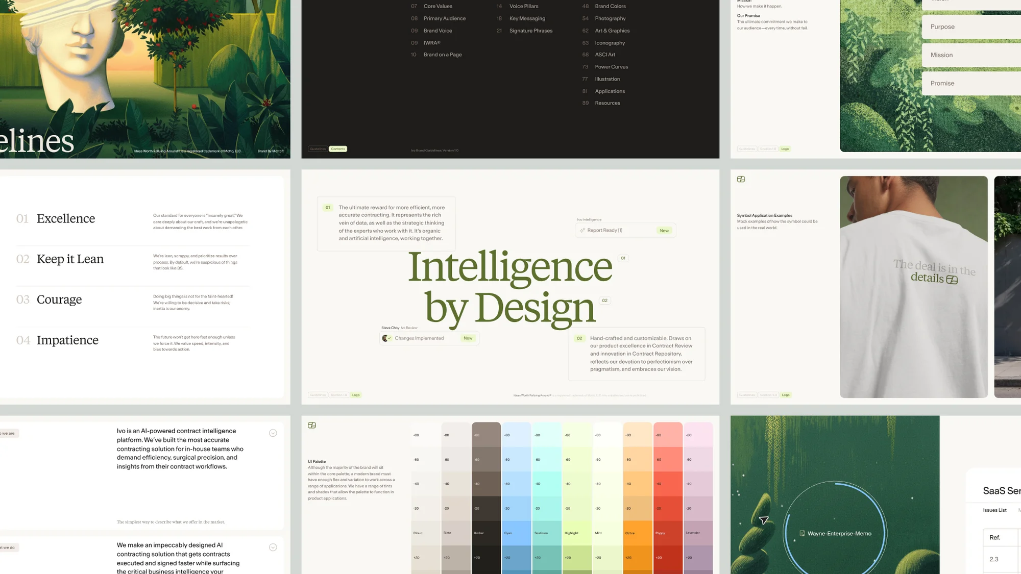
Part 7: Brand Guidelines Document
All of the above means nothing if it’s scattered across a folder the client can’t navigate. The brand guidelines document is what ties everything together — and it’s one of the most valuable things you can deliver.
✅ Cover Page
Branded, with the client name, date, and version number.
✅ Brand Story / Introduction
A brief section on the brand’s purpose, positioning, and values.
✅ Logo Usage Section
All logo variations, clear space rules, minimum sizes, and do/not-do examples.
✅ Colour Section
Full palette swatches with all colour codes and usage ratios.
✅ Typography Section
All typefaces with specimens, weights, sizing scale, and example usage.
✅ Imagery Section
Photography and illustration guidelines with curated examples.
✅ Application Examples
Mockups showing the brand applied to real surfaces: business card, phone screen, packaging, social media, etc.
Part 8: Delivery — The Step Most Designers Skip
You can complete every item on this checklist and still deliver a frustrating client experience if the handoff itself is a mess.
The most common problems at delivery:
- Files dumped in a ZIP with no folder structure
- Colour codes buried on page 14 of a PDF
- No single source of truth — assets split across Drive, Dropbox, and email
- Brand guidelines that go out of date the moment a small update is made
This is where BrandKity changes the workflow.
BrandKity is a free brand kit tool that lets you organise all of a client’s logos, colours, fonts, visuals, files, and guidelines into one clean, shareable link. Instead of a ZIP file and a PDF, you send one URL — and the client can access everything they need, in one place, from any device.
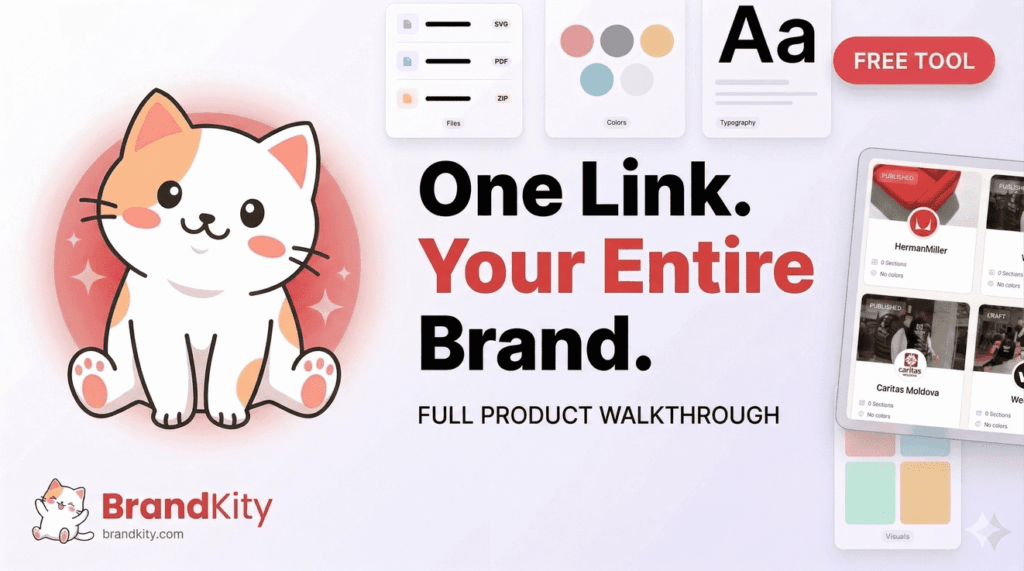
For freelance designers, the practical benefits are immediate:
- Centralised delivery: Every asset and guideline lives in the same place, no more chasing files across platforms.
- Always up to date: When a logo gets refined or a colour gets adjusted, you update it once in BrandKity and the link is instantly current — no re-sending, no “use the latest version” emails.
- Professional presentation: Clients receive something that looks and feels like a polished brand portal, not a Google Drive dump.
- Reusable for ongoing work: The brand kit stays live, so when the client comes back six months later for new deliverables, everything is exactly where you left it.
It takes about ten minutes to set up after your project is complete — and it eliminates one of the messiest parts of freelance design work entirely.
The Checklist at a Glance
Here’s a condensed version you can save, print, or paste into your project management tool:
Logo System
- [ ] Primary logo (full colour)
- [ ] Horizontal and stacked variations
- [ ] Icon / symbol mark
- [ ] Monochrome (black and white) versions
- [ ] Reversed / light-on-dark version
- [ ] Minimum size and clear space documentation
- [ ] All file formats (SVG, PNG, PDF, EPS/AI)
Colour Palette
- [ ] Primary palette with HEX, RGB, CMYK, Pantone values
- [ ] Secondary palette
- [ ] Colour usage rules and ratios
- [ ] Approved text/background pairings (accessibility checked)
Typography
- [ ] Primary/display typeface with weights
- [ ] Secondary/body typeface
- [ ] Type scale (H1–H4, body, captions)
- [ ] Letter spacing and line height specs
- [ ] Font files or licence instructions
Imagery & Visual Style
- [ ] Photography style guide
- [ ] Illustration style (if applicable)
- [ ] Icon style and grid
- [ ] Pattern/texture assets
Brand Voice
- [ ] Mission and values
- [ ] Personality descriptors
- [ ] Tone of voice guidelines
- [ ] Tagline and key messages
Application Templates
- [ ] Business card
- [ ] Email signature
- [ ] Social media profile and banner templates
- [ ] Social media post templates
- [ ] Letterhead / document template
- [ ] Presentation template
Brand Guidelines Document
- [ ] Logo usage section
- [ ] Colour section
- [ ] Typography section
- [ ] Imagery section
- [ ] Application mockups
Delivery
- [ ] All assets organised and named consistently
- [ ] Brand kit link created and shared (BrandKity)
- [ ] Client walkthrough or handoff notes
Final Thought
The best brand identity work in the world has less impact than it should when the delivery is sloppy. Clients can’t use what they can’t find. They can’t stay on-brand with guidelines they’ve never re-opened.
Going through this checklist on every project — and using a tool like BrandKity to centralise your delivery — turns a completed design job into something the client actually lives with and returns to. That’s what builds long-term client relationships and earns referrals.
Save the checklist. Run it on your next project. Then send one link instead of a folder.
Have a brand identity workflow that works for you? Share it in the comments — we’d love to know how other freelance designers are handling the handoff.